

One of the final touchpoints for store visitors before they convert is your call to action button. It’s really important to guide your visitors through their buying journey using strategic CTAs.
At this point, you’ve done everything right. You’re driving traffic, your design looks amazing, everything is in place. But your Shopify store just doesn’t seem to be converting enough.
One thing many merchants failed to look at is their CTAs (calls to action).
What are Calls-to-Action?
CTAs are buttons used on a site that tell your visitors what to do. For example, your product page will have a call to action to buy a product or your homepage will have a call to action to shop your latest collection.
A clear-call-to-action on every page allows you to point potential customers towards where you want them to go in your conversion funnel. CTAs can vary depending on the action you want them to take. The more direct approach will encourage visitors to buy a product or a softer approach would be a newsletter subscription button.
Keeping website visitors engaged can be a challenge, people are busy, they may be checking out your store when they’re out so it’s crucial that you use the appropriate CTAs in the right places with a benefit-oriented copy.
The CTAs should be fitting with the page they’re on and what you want them to do. For example, on a product page, a visitor will have an interest in buying. Someone on a blog or other content page will be interested in learning more. A CTA is pretty much a gentle push towards what they want to do.
CTA Copy
There aren’t any specific rules with your calls to action, but there are definitely some best practices that can help convert or get a few more sign-ups to your newsletter.
Your CTAs are massively psychology based. They play on the fear factor of visitors, for example, “Buy Now” or “Shop Now”. People tend to respond to urgency, putting a timeframe on something will urge users to take action.
CTA Placement
The success of your CTR (click-through-rate) on buttons is largely linked to placement. If your CTA is down at the bottom of the page and a visitor has to scroll all the way to get to it then it’s very unlikely that it will convert.
Above the fold is one of the surefire ways to convert with your buttons, this means a visitor doesn’t have to scroll or try to find the button. As a merchant, you should be considering using strategic placement for your CTAs. This doesn’t mean spam them everywhere!
For example, on your homepage, you will show products to let visitors know what your store is about and what product you offer. But when they navigate to a product page it’s time to inform and convert. On a product page, CTAs should be above the fold and should be clear to visitors.
Button Colour
The best way to establish what button colours work best for your store is to split test. Using different colours whilst A/B testing will help you understand which colours convert more.
For the most part, you should choose a button colour that stands out from the rest of the page and fits with your branding and eCommerce store.
Best Call to Action Buttons for eCommerce Stores
Your CTA buttons should be benefit-oriented to the user. They should explain briefly what action they will be taking by clicking the button. Visitors like to know what they’re clicking on and why, rather than using the typical “Learn More” you should expand on what action they will be taking, such as; “Read Our Case Study”. This way, your visitors know exactly what they’re clicking and where it will take them.

Here are the CTAs that you should have on your eCommerce store:
Buy & Add to Cart CTA
The buy button is one of the most important call-to-action buttons on your entire store. Your CTA should stand out from the rest of your CTAs and especially on-page. Second to a buy button, your add to cart button is equally as important. The goal of your buy and add to cart button is to get users to click the add to cart button and minimise any friction between users clicking add to cart and then the buy bottom.
Social Follow & Share CTAs
Be sure to include social follow and share CTAs throughout your store. The same principles still apply, be mindful of placement and make sure they don’t cause any friction for customers who are shopping.
Using social share and follow buttons will help build a community for your business that you can sell to at a later date.
Coupon Codes
Coupon codes are one of the best ways to get visitors to join your mailing list. For customers, it’s great receiving coupon codes for a website you’ve just visited. This can build a good level of engagement between your business and potential customers in your list.
Email Subscriptions
Not everyone that visits your website will convert at first. A great way to retain those visitors and keep them in your funnel until they’re ready to purchase is by using newsletter subscription CTAs throughout your site.
Once you have a visitors email in your list you don’t have to pay again to get them back into your funnel.
One of the most simple ways to do this is via a homepage callout, you may want to incentivise this by offering visitors that sign up a discount.
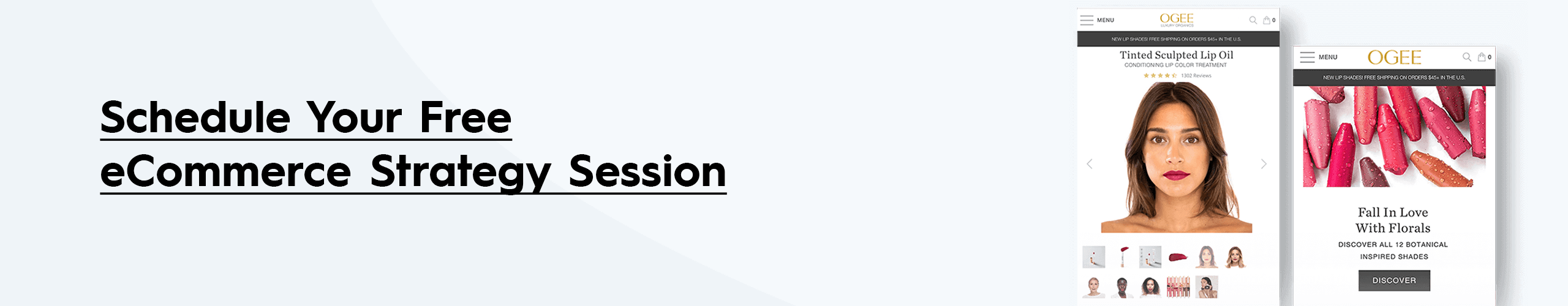
Arrange a strategy session by clicking below where we’ll look at your current goals and brand vision and the best steps to help you grow!